Items
Items are specialized components used to render elements within a Collection.
The KDK provides a set of pre-built Items components that can be used directly or serve as a foundation for developing your own custom items.
Pre-built Items
KItem
TODO
KCard
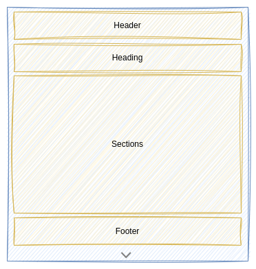
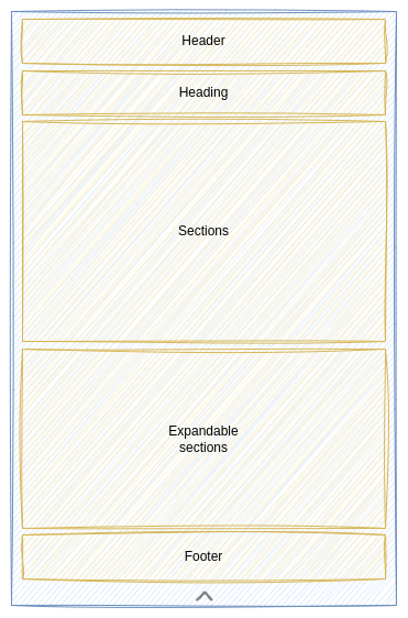
A KCard display the item information using a card. The KCard is divided into multiple parts:

both Header and Footer parts are implemented using a KPanel. That means you car provide any Content you want.

the Heading part displays data into two areas:

- a Title extracted from a
nameproperty - an Avatar using the initials of the title
- a Title extracted from a
the Sections part is implemented using 2 KPanel. One panel to display the visible sections, and a second panel to display expandable sections. Depending on whether you provide expandable sections or not, an expand button is displayed to expand or to reduce the card.

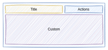
A section is typically implemented using the KCardSection component as its base. A KCardSection follows the schema below:

- the Title of the section
- the Actions assigned to the section and implemented using a KPanel
- the Custom part you need to implement.
Custom Items
TODO