Components
Catalog
The k-catalog is used to list all available layers in catalog and organize them by category. A category is defined by the following properties:
- name: internal name,
- label: display label,
- icon: display icon,
- order: weight to order the category within the catalog. You can specify a value between 1 and 100. Categories with the lowest weight are displayed first. Basemaps are displayed last with a weight of 100.
- options:
- exclusive:
trueif layer selection in the category should be exclusive (defaults tofalse), - open:
trueif layer category should initially be open in the catalog component (defaults tofalse), - filter: a filter supported by sift to select layers from the catalog belonging to the category
- exclusive:
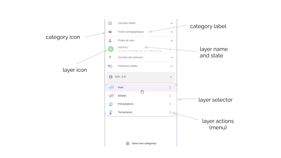
This component relies on some others internal components:
- k-layers-list used to list a set of layers and manage the selection
- k-weather-layers-selector used to list all available weather related layers (forecasts and archives) and for each model provided by Weacast
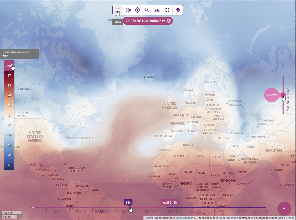
Color legend
The k-color-legend is used to display the legend associated to color mapped layers in catalog and allow to switch between different display units whenever required.
TIP
Will automatically hide/show whenever a layer with appropriate configuration is hidden/shown.
Level slider
The k-level-slider is used to display available levels on e.g. weather layers and allow to switch between them whenever required.
TIP
Will automatically hide/show whenever a layer with appropriate configuration is hidden/shown.
Position indicator
The k-position-indicator is used to display the geographical coordinates of the current mouse position.
Timeline
The k-timeline is used to display the time range of the weather prediction model associated to a weather layer. It allows to jump in time whenever required.
The main methods are the following:
- setupTimeline() setups the timeline according to currently selected forecast model time range if any (see Weacast mixin) or based on the following global frontend configuration properties:
- start: offset in seconds from now the timeline should begin
- end: offset in seconds from now the timeline should end
- getTimelineInterval() default timeline interval function
- getTimelineFormatter() default timeline formatting function
Widgets
Timeseries
The k-time-series-widget is used to display weather probes or measurements at a specific location as a set of timeseries graphs in mapping activities and allow to show/hide relevent elements.
Here is a view of the widget:
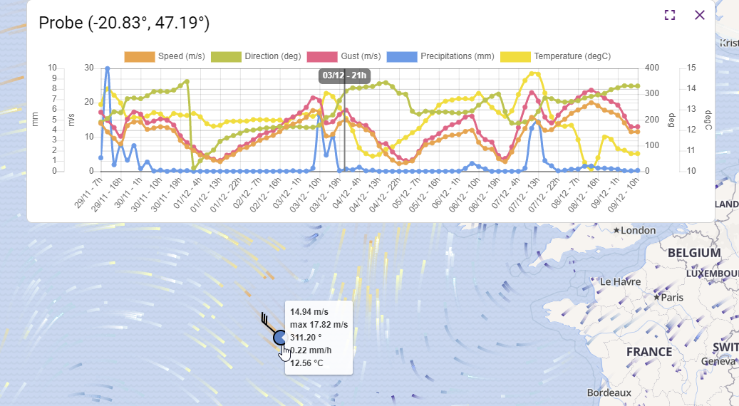
The main methods are the following:
- refresh() updates the marker layer used to locate where the probe measurements come from and updates the probe timeseries graph
TIP
The component keeps in sync the timeseries widget visibility state and any change in time format, forecast model (see Weacast mixin), or current time.
Infobox
The k-information-box is used to display feature properties as a table.
The main methods are the following:
- refresh() updates the information box content based on the layer or feature schema
TIP
The component allows to copy-paste feature properties or export feature as GeoJson.
Map Viewers
The k-mapillary-viewer and k-panoramax-viewer are used to display street-level imagery
The main methods are the following:
- refresh() updates the imagery based on the currently selected position or feature
TIP
The component keeps in sync the viewer widget and any change in current time.
You can select the location on the map using the layer, and the widget will appear with the location. The marker with getMarkerFeature will update the position on the map.
If on the viewer, the picture update (changing position, like avancing on the street), the widget will centerMap on the new location.
Mapillary Viewer
The k-mapillary-viewer is used to display street-level imagery coming from Mapillary.
It uses Viewer from mapillary-js, with the functions .moveTo(imageId), to View an image .resize(), to resize the Viewer per the widget resize .on('image', onImageEvent), event for the update of image on the viewer (changing position, like avancing on the street)
Panoramax Viewer
The k-panoramax-viewer is used to display street-level imagery coming from Panoramax.
There can be difference instance of panoramax.
Panoramax uses pnx-photo-viewer with the endpoint, sequenceId and pictureId. It has the event @select event for sequence/picture selection
Map
Although some dedicated components do exist, you usually rely on provided mixins to build your own map.
Kano provides a good starting point to build your own Map Activity.
Location
The KLocationMap allows to display a location on a map using a marker.
The k-location-field provides you with an autocomplete address search input powered by the geocoder service to be embedded in a k-form.
Globe
No dedicated component exist at the moment, you usually rely on provided mixins to build your own globe.
Kano provides a good starting point to build your own Globe Activity.
Navigation Bar
The k-navigation-bar groups together the main actions available on a mapping activity. See e.g. Kano configuration options for more details.
Here is a view of some of the components presented previously:
Legend
The KLegend component acts as a container of multiple layer legends which are grouped in sublegends.
Each of these sublegends is rendering using an Expansion Item.
Tipically, sublegends declaration is done within the application's API configuration and is accessible using the catalog service.
{
  name: 'Sublegends.HYDROGRAPHY', // name as i18n translation key
  i18n: {  // i18n translations
    fr: { Sublegends: { HYDROGRAPHY: 'Hydrographie' } },
    en: { Sublegends: { HYDROGRAPHY: 'Hydrography' } }
  },
  headerClass: 'bg-grey-3 text-weight-regular',  // class to be used to render the q-expansion-item header
  options: {
    open: true,  // set the q-expansion-item default opened
    filter: { type: 'OverlayLayer' , tags: { $in: ['hydrography'] } }  // layers filter
  }
}
And layer legends information is part of the layer declaration in a dedicated legend object. It consists in a legend objet or an array. A legend objet is defined by the folowwing properties:
- a type defining the type of the legend to be rendered. It is mandatory.
- a label defining the caption of this legend
- a minZomm definig the minimum zoom
- a mawZomm definig the miximum zoom
- a content describing the content of the legend which must conform the type formalism.
It exists 3 different types of legend:
- KImageLegend: a legend represented as an image
legend: {
  type: 'image',
  label: 'An image'
  minZoom: 9
  content: {
      src: 'https://wxs.ign.fr/static/legends/INSEE.FILOSOFI.POPULATION-tot-legend-2017.png',
      width: '234px',
      height: '58px'
    }
  }
}- KColorScaleLegend: a legend represented as a color scale
legend: {
  type: 'color-scale',
  label: 'A color scale'
  content: {
    classes: [
       0, 1, 5, 10, 100, 1000
    ],
    colors: 'Reds',
    label: 'Reds color scale',
    unit: 'ml'
  }
}- KSymbolsLegend: a legend represented a multi map of pair of symbols and labels.
legend: {
  type: 'symbols',
  label: 'Multiple sections legend',
  content: [{
    section1: [
      { symbol: { 'media/KShape': { type: 'rect', color: 'blue' } }, label: 'Blue' },
      { symbol: { 'media/KShape': { type: 'rect', color: 'red' } }, label: 'Red' },
      { symbol: { 'media/KShape': { type: 'rect', color: '#green' } }, label: 'Green' }
    ],
    section2: [
      { symbol: { 'media/KShape': { type: 'circle', color: 'purple' } }, label: 'Purple' },
      { symbol: { 'media/KShape': { type: 'circle', color: 'yellow' } }, label: 'Yellow' },
      { symbol: { 'media/KShape': { type: 'circle', color: 'orange' } }, label: 'Orange' }
    ]
  }]
}
The content of a legend can be adapted according to the zoom level using multiple legends:
legend: [
  {
    type: 'symbols',
    label: 'Adaptative zoom legend',
    minZoom: 6,
    maxZoom: 13,
    content: {
      symbols: [
        { symbol: { 'media/KShape': { type: 'rect', color: 'blue' } }, label: 'Blue' },
        { symbol: { 'media/KShape': { type: 'rect', color: 'red' } }, label: 'Red' },
        { symbol: { 'media/KShape': { type: 'rect', color: '#green' } }, label: 'Green' }
      ]
    }
  },
  {
    type: 'symbols',
    label: 'Adaptative zoom legend',
    minZoom: 14,
    content: {
      symbols: [
        { symbol: { 'media/KShape': { type: 'circle', color: 'purple' } }, label: 'Purple' },
        { symbol: { 'media/KShape': { type: 'circle', color: 'yellow' } }, label: 'Yellow' },
        { symbol: { 'media/KShape': { type: 'circle', color: 'orange' } }, label: 'Orange' }
      ]
    }
  }
]
TIP
It is also possible to add your own type of legend. You must implement the component responsible of the rendering and register it to the KLegend through the renderers prop. The component must overload the abstract KLegendRenderer component.
Attribution
- Kattribution : a component that dynamically displays visible layer attributions (credits and copyright information) in map activities. This component guarantees compliance with copyright rules for data displayed on the map.
Here are views of the component :
 Attribution closed
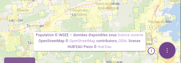 Attribution opened
How it works
The component listens to layer visibility events to add or remove attributions as layers are displayed or hidden. The main allocation is displayed in a popup that the user can open by clicking on a circle with the "i ” symbol.
This popup has several sections:
Header: Optional, configured via the ‘header’ section in configuration.
Dynamic body: Generates and displays allocations based on visible layers.
Footer: Optional, configured via the
footersection.
Configuration
KAttribution is configured in config/default.js. It must be configured as a sticky in mapActivity and globeActivity, and is systematically positioned bottom-right (position: 'bottom-right') offset (offset: [80, 24]) to the left of the FAB.
Example configuration :
module.exports = {
  mapActivity: {
  ...
    stickies: {
    content: [
      { id: 'attribution', position: 'bottom-right', offset: [80, 24], component: 'KAttribution' },
      // Other components if required
    ]
    },
  }
}
TIP
If the FAB does not exist, the offset must be adjusted: (offset: [24, 24]).
You can also customize the header and footer sections :
header and footer: allow you to add additional information (for example, a
KStampcomponent to display a specific text).headerClass and footerClass: define CSS classes to style the header and footer.
Example configuration:
attribution: {
  header: [
    {
      id: 'attribution-header',
      component: 'KStamp',
      text: 'Map credits'
    }
  ],
  headerClass: 'bg-secondary',
  footer: [
    {
      id: 'attribution-footer',
      component: 'KStamp',
      text: 'Please respect copyright'
    }
  ],
  footerClass: 'bg-secondary'
}