Components
Activity
An activity is the entry point used in applications for interacting with the user using business specific components. It usually represents a single screen with a user interface. For example, an email app might have one activity that shows a list of new emails, another activity to compose an email, and another activity for reading emails. Although the activities work together to form a cohesive user experience in the email app, each one is independent of the others as much as possible. As such, you should be able to start any one of these activities within the application or from an external application by activating a given route (i.e. link/URL).
There is no generic activity component within the core module because activities are usually business/domain-specific components (you might find a lot of them in others modules or in applications). However, it facilitates the interactions between activities and application as you will see hereafter.
Layout
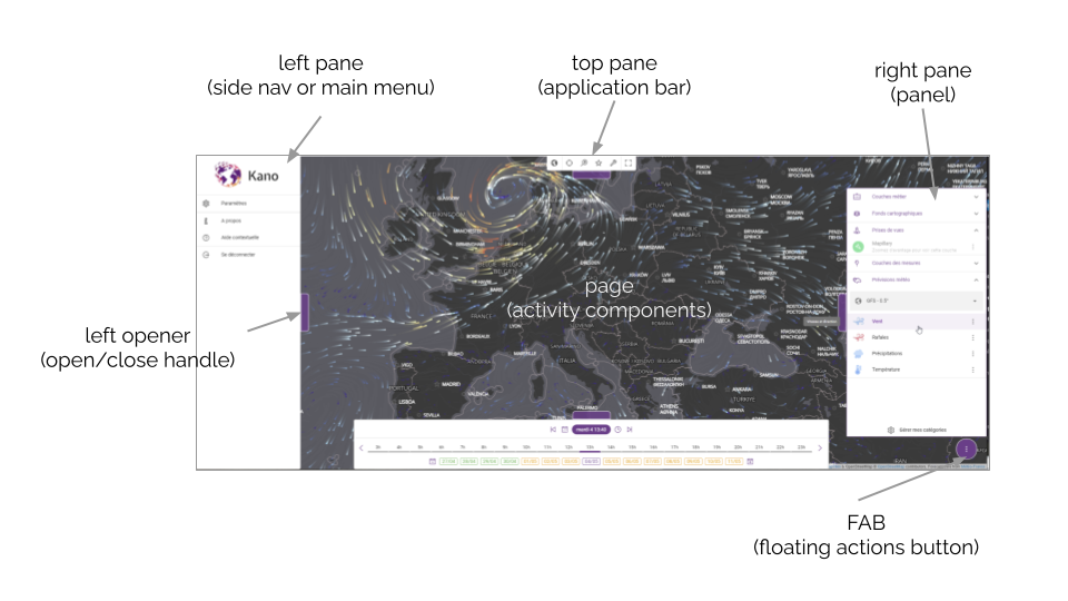
The basic application layout relies on Material Design and is composed of a page with different panes that can de open/closed on-demand, as illustred in our Kano application:
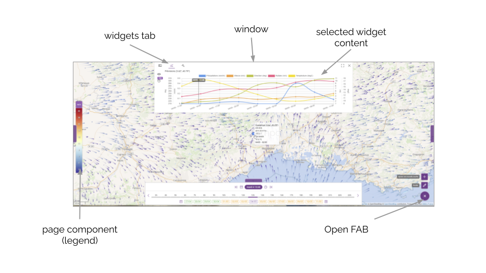
Here is the layout in a different configuration to show additional components like the window composed of different widgets to be selected using a tab and the FAB (floating actions button):
The layout is flexible enough to only use part of it like e.g. the Kalisio Crisis application is not a map-centered UI and the bottom/right panes are not always used for instance. Althought it can be built programmatically it aims at being constructed from the application configuration as well.
The k-layout component based on QLayout contains the elements that wrap application's content:
- header: page header based on q-header
- footer: page footer based on q-footer
- page: activity components are injected using nested routes and lazy-loading
The embedded content of the page (i.e. the Activity) is a router-view pointing to a KPage component, which consists of a:
- top pane: a panel shown on top of the page - usually used as an application bar
- left pane : a left side navigation panel - usually used as a main menu
- right pane : a right side panel - usually used as an additional contextual panel
- bottom pane: a panel shown at the bottom of the page
- fab: an action button based on a Quasar Floating Action Button at the bottom right corner of the page
- page content: additional page components to be dynamically injected into the activity
- window: a top window, which can be maximized, composed of a set of widgets to provide additional graphical content
TIP
The application layout is usually wrapped using the k-home component that simply load it depending on the authentication state of the user. You can directly use the k-layout if you'd like.
Some layout components are fixed for the entire application lifecycle, as such they read their own setup from the application configuration: layout properties, header, footer.
Others components are more dynamic and support to be updated depending on the current activity of the user: panes, window, FAB. In this case the configuration is read from the global store and any change watched to keep the components in sync. The initial state of the store can be fed from the application configuration as well. In this case, a binding will occur at runtime between the configured content and the target Vue component (i.e. activity or item objects). The default behaviour is to read the configured content of the activity named my-activity from the myActivity (camel case) property in the application configuration.
TIP
The best thing to do to learn how to configure your application is to have a look to the config files of our production applications like Kalisio Crisis and Kano
In order to provide a consistent look & feel as much as possible, components or user actions (i.e. buttons) in the window, FAB and the different panes are created through the following base components:
- k-action: action button with different rendering mode depending on the context (
button,form-button,item,fab,fab-action, etc.) - k-content: a list of dynamic components which default to create k-action components from configured properties as a default behaviour
- k-panel: a row/column of stacked k-content components (depending on the
horizontalorverticalvalue of thedirectionproperty)
Collections
Most activities are used to list, search, edit (i.e. update) and remove data model items. To avoid a lot of boilerplate code the KDK provides you with built-in components to manage item collections either as list or grid as shown below:
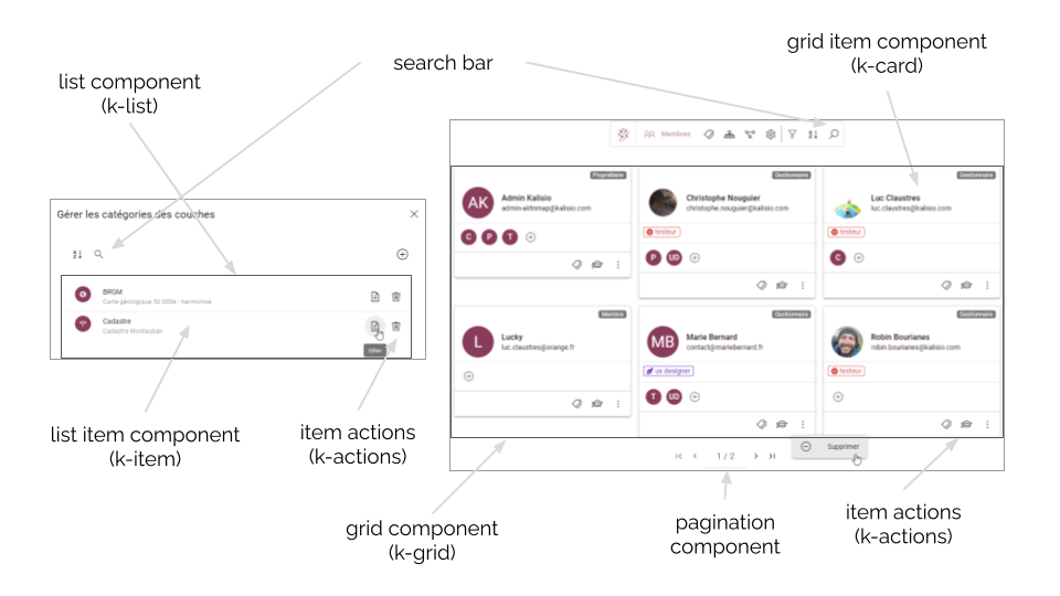
List
The k-list component is powered by Quasar lists and Quasar pagination. It also relies on the service and collection mixins to manage its internal behaviour.
The following properties can be used to customize it:
- renderer:
- component: the component to be used to render items (defaults to
collection/KItem) - options: options of the rendrer,
- props: properties to be bound to the item components
- component: the component to be used to render items (defaults to
- baseQuery: the base query to be used when retrieving items from the target service
- filterQuery: the additional query parameters to be used to filter items according to current search criteria
- listStrategy: the update strategy used under the hood by feathers-reactive
The default KItem component is powered by the base item mixin and provides you with the following properties:
- item: the object to be displayed
- itemActions: the list of actions available on the object, each action been described as
- label: action label in the action menu
- route: route to be pushed when action is triggerred
- handler: function to be called when action is triggerred
- options:
- icon: icon to be used
- color: icon color to be used
- avatar: avatar image to be used
- nameField: the name or path of the property used to retrieve the displayed name on the object, defaults to
name - descriptionField: the name or path of the property used to retrieve the displayed description on the object, defaults to
description
The default KItem component also provides you with the following slots will you need more customisation:
item-iconoritem-avatarto override icon or avatar sectionitem-contentto override content sectionitem-labelanditem-sublabelto override labels sectionitem-actionsto override actions section
Grid
The k-grid component is powered by Flex, Quasar cards and Quasar pagination. It also relies on the service and collection mixins to manage its internal behaviour.
The same properties as with the k-list component can be used to customize it, the component to be used to render items defaults to collection/KCard.
The default k-card component is powered by the base item mixin and provides you with the same properties as the KItem component but available slots are the following:
card-titleto override title sectioncard-iconto override icon sectioncard-tagsto override tags sectioncard-contentto override content sectioncard-actionsto override actions section
However options of the itemActions are more complex:
- pane: the list of actions displayed in the pane, each action been described as
- name: unique action name/ID
- icon: action icon
- label: action label in the action menu
- route: route to be pushed when action is triggerred
- handler: function to be called when action is triggerred
- menu: the list of actions displayed in the menu, each action been described as above
Table
The k-table component is powered by Quasar lists and Quasar pagination. It also relies on the service and collection mixins to manage its internal behaviour.
The same properties as with the k-grid component can be used to customize it. There is no specific component to be used to render items as it relies on the rows of the table. As a consequence, the item-actions property has to be directly set on the k-table component.
Items
Forms
The k-form is a generic form component capable of building HTML forms from of a JSON schema. Moreover k-form validates that the data is conformed to the schema using AJV validator.
A schema must have the following convention:
- a
$schemaproperty specifying the version of the schema - a
$idproperty specifying the id of the schema. It is mainly used by AJV to cache the schema. - a
titleproperty specifying the title of the form. It is used by the Editors. - a
descriptionproperty providing a brief description of the usage of the schema - a
typewhich must beobject - a
propertiesproperty which define the list of the fields of the form. To each object is assigned a field. The name of the field is the name of the object and the properties are used to provide the characteristics of the field. Afieldsub-object provides the UI characteristic to assign to the field: the component to be used for the rendering as well as the properties to apply to this component. requiredproperty to define the required fields. You must specify the name of the fields.
As an example, here is a schema defining a basic form asking for an email and a password:
{
  "$schema": "http://json-schema.org/draft-07/schema#",
  "$id": "A unique identifier",
  "title": "The title of the schema",
  "description": "A description of the schema",
  "type": "object",
  "properties": {
     "email": {
      "type": "string",
      "format": "email",
      "field": {
        "component": "form/KTextEmail",
        "label": "schemas.EMAIL_FIELD_LABEL"
      }
    }
    "password": {
      "type": "string",
      "format": "password"
      "field": {
        "component": "form/KTextPassword",
        "label": "schemas.PASSWORD_FIELD_LABEL"
      }
    }
  },
  "required": ["name", "password"]
}
The KDK comes with a set of built-in fields:
- k-attachment-field: an input used to upload a document
- k-chips-field: a basic chips input based on Quasar Select input
- k-chips-with-icon-field: extends the previous chips input in
- k-datetime-field: a Quasar Date input and Time input
- k-email-field: a Quasar Text input of type of
email - k-icon-field: an input that allows you to select an icon and to assign it a color among. The list of icons is provided by FontAwesome
- KItem-field: an input that allows you to select one or multiple items from one service or many services.
- k-number-field: a Quasar Text input of type of
number - k-options-field: a Quasar Options group input
- k-phone-field: a Quasar Text input of type of
phone - k-select-field: a Quasar Select input
- k-tag-field: an input that allows you to define a set of tags
- k-textarea-field: a Quasar Text input of type of
textarea - k-text-field: a Quasar Text input of type of
text - k-toggle-field: a Quasar Toggle input
- k-url-field: a Quasar Text input of type of
url
You can add additional ones, for instance, the map submodule provides the k-location-field. You can also add your own field, when implementing it you must rely on the base field mixin.
The properties to declare a k-form are the following:
- schema: the schema object to be used to build the form
- clearOnCreate: boolean indicating if the form should be cleared on creation
- display: the options to be used when displaying the fields. You can specify:
- icon: a boolean value to tell whether an icon has to be displayed or not in front of each field
- label: a boolean value to tell whether the field label have to be displayed or not in front of each field
- labelWidth: the width used to display the label. Out of 12 grid points, how much should the label take? Default is 5. Minimum is 1 and maximum is 11
TIP
Because, the k-form loads dynamically the required components to build the form, it is mandatory to use use a reference to the form using the keyword ref and the refs resolver mixin to wait for the components to be loaded before applying any methods.
The k-form components exhibits the following methods:
- getField(name) get a field component by its name
- build() dynamically build the required field components and internal validator
- fill(values) fill the form with given object values
- clear() clear the form back to default values
- validate() validate the form
- apply(object) call apply() on all field components
- submitted(object) call submitted() on all field components
TIP
If the schema props is defined on creation the form will automatically build itself and emit the form-ready event.
Editors
The Editors are built-in editors that allow you to create/edit an object/perspective using a k-form. Thus we distinguish the following modes:
- the
createmode allows you to create a new object - the
updatemode allows you to edit an existing object or a perspective. In that case you must provide to the editor the object id of the object to edit and the perspective name if wanted.
The KDK comes with 2 types of editor:
- the k-editor which is rendered within the parent container
- the k-modal-editor which is rendered within a modal widget
Both components depend on different mixins according to the following lifecycle:
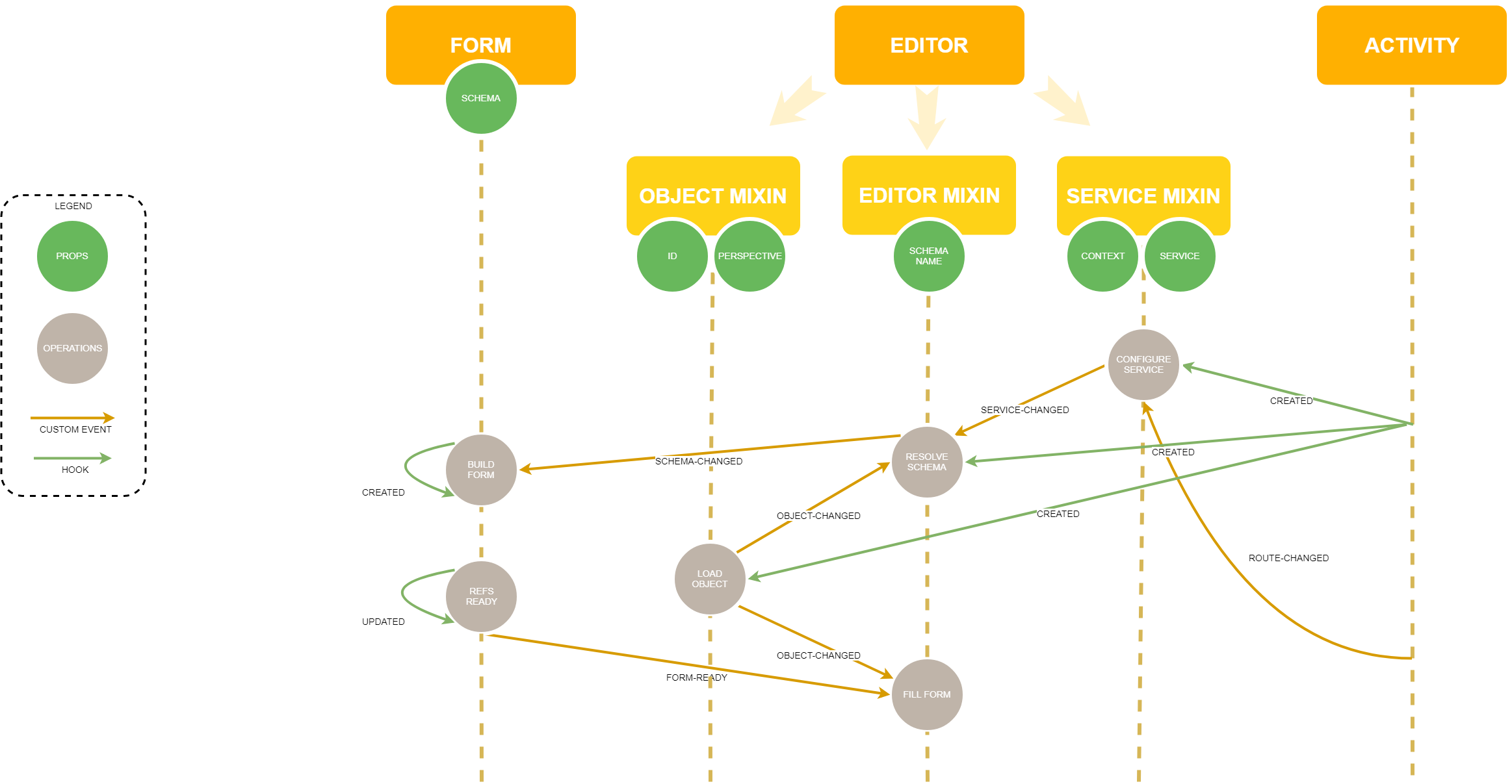
k-editor
The following example shows how to edit the profile perspective of a user (service users):
<k-editor service="users" :objectId="objectId" perspective="profile"/>The properties to declare a k-editor are the following:
- objectId: the Id of the object to edit. If not defined, the editor is in the
createmode - perspective: the perspective of the object to edit
- schemaName: the name of the schema to be used to build the corresponding k-form. If you do not provide any name, the editors will search for a schema with the name:
- in
createmode:<service>-create.json - in
updatemode:<service>-update.json
- in
- baseObject: an default object to be used to keep track of existing additional properties to the ones edited through the form
- baseQuery: a query to be executed to customize the access to the service
- clearButton: the label of the clear button. When clearing the editor, all the fields are emptied. By default the property is empty and the button is not rendered.
- resetButton: the label of the reset button. When resetting the editor, the form is filled with the default object. By default the property is empty and the button is not rendered.
WARNING
Schemas are usually stored in a specific folder and you must have tell Webpack to look in this folder when searching for a schema.
k-modal-editor
There are 2 ways to use the k-modal-editor:
- by declaring the k-modal-editor directly in the parent component. Check out the code example here
- by declaring a route using the the KModalEditor. In this case you must:
- in the template section, define a
router-viewwith the following properties:- the targeted
service
- the targeted
- in the template section, define a
<div>
  ....
  <router-view service="groups"></router-view>
</div> router () {
return {
onApply: { name: 'groups-activity', params: { contextId: this.contextId } },
onDismiss: { name: 'groups-activity', params: { contextId: this.contextId } }
}
}- define a function that trigger the navigation to the editor route, usually an action within an activity:
 this.registerFabAction({
    name: 'create-group',
    label: this.$t('KGroupsActivity.CREATE_GROUP_LABEL'),
    icon: 'add',
    route: { name: 'create-group', params: { contextId: this.contextId } }
})- define the corresponding route with:
- the
nameof the route - the
componentproperty set to editor/KModalEditor - the
propsproperty set to totrue
- the
'groups': {
  name: 'groups-activity',
  component: 'KGroupsActivity',
  props: true,
  children: {
  'create': { name: 'create-group', component: 'editor/KModalEditor', props: true },
  'edit/:objectId': { name: 'edit-group', component: 'editor/KModalEditor', props: true }
}
The properties to declare a k-modal-editor are identical to those of the k-modal-editor plus:
- router: the router function to be triggered when the editor is getting closed.
Basics
KStamp
The KStampcomponent is designed for displaying text with an optional icon, supporting dynamic font sizing, text truncating and flexible layout (horizontal or vertical).
KChip
The KChip component extends Quasar’s QChip, adding full support for HTML colors and an automatic tooltip for truncated text. It maintains the core functionality of QChip while improving color flexibility and usability:
- Unlike
QChip, which primarily supports Quasar’s predefined color classes,KChipallows any valid HTML color - The
labelprop is automatically translated - It detects whether the label text is truncated inside the chip and automatically displays a tooltip to show the full text if needed
Content
KContent
The KContent component is responsible for dynamically rendering components based on provided content, filtering criteria, and visibility conditions. It supports Quasar and non-Quasar components and non-Quasar components are rendering using asynchronous loading.
KPanel
The KPanel component acts as a wrapper for KContent, dynamically managing its visibility and layout: horizontal or vertical.
Graphic
Shapes
The KDK provide a convenient component to render an SVG shape using the KShape component. Under the hood it relies on the createShape function and requires an objet conforming to the following specification:
{
  shape: 'circle', // represent a registered SVG shape
  size: ['24px', '24px'], // array of HTML sizes
  radius: undefined,  // alternative to the size property.
  color: 'black', // any HTML color or [Quasar color](https://quasar.dev/style/color-palette/)
  opacity: 1.0, // range from 0.0 (transparent) to 1.0 (opaque)
  stroke: {
      color: 'black', // any HTML color or [Quasar color](https://quasar.dev/style/color-palette/)
      width: 1, // any positive value
      opacity: 1.0, // range from 0.0 (transparent) to 1.0 (opaque)
      cap: 'round', // https://developer.mozilla.org/en-US/docs/Web/SVG/Attribute/stroke-linecap
      join: 'round', // https://developer.mozilla.org/en-US/docs/Web/SVG/Attribute/stroke-linejoin
      dashArray: 'none', // https://developer.mozilla.org/en-US/docs/Web/SVG/Attribute/stroke-dasharray
      dashOffset: 0 // https://developer.mozilla.org/en-US/docs/Web/SVG/Attribute/stroke-dashoffset
  },
  icon: {
    classes: undefined // must be specified, e.g 'las la-home'
    url: '' // url to the image to be displayed. Alternative to the classes property
    color: 'black', // any HTML color or [Quasar color](https://quasar.dev/style/color-palette/)
    opacity: 1.0, // range from 0.0 (transparent) to 1.0 (opaque)
    size: '14px', // any HTML size
    translation: ['-50%', '-50%'], // translation to apply to render the icon relative to the shape
    rotation: 0 // rotation to apply to render the icon relative to the shape
  },
  text: {
    label: undefined, // text to be displayed
    color: 'black', // any HTML color or [Quasar color](https://quasar.dev/style/color-palette/)
    size: '12px', // any HTML size
    translation: ['-50%', '-50%'], // translation to apply to render the text relative to the shape
    rotation: 0, // rotation to apply to render the text relative to the shape
    extraStyle: 'background-color: #1A1A1A' // additional CSS to be applied to text
  },
  extraStyle: 'transform: translate(50%, 0%)', // additional CSS to be applied to the whole element (ie shape, icon and text)
  html: null // an HTML element to be rendered
}
The KDK comes with a set of predefined marker shapes: circle, rect, rounded-rect, diamond, triangle, triangle-down, triangle-left, triangle-right, star, marker-pin, square-pin. But it allows you to register you own shape. For that, you have to define the shape such as below:
Shapes['my-shape'] = {
  content: // the SVG path of the shape (required)
  viewBox: // the bounding box of the path (required)
  icon: {
    translation: // the default translation to apply to render the icon. Default value is ['-50%', '-50%'] (optional)
  },
  text: {
    translation: // the default translation to apply to render the text. Default value is ['-50%', '-50%'] (optional)
  },
  anchor: 'bottom-center', // the anchor of the shape. Default value is `center-center` (optional)
  radiusToSize: (r) => { return ...  }, // a function to compute the size according a radius. Default function returns the double of the radius (optional)
  extraStyle: 'background-color: #1A1A1A', // additional CSS to be applied to the shape (optional)
},
Tip
Checkout the Miscellaneous activity to see examples.
Color scales
The KColorScale component helps to render Chroma color scales. You can provide the scale, domain and classes properties and also a label as well as a direction (vertical or horizontal).
Tip
Checkout the Miscellaneous activity to see examples.
Chart
The KDK provides a helper component that allows rendering charts based on chart.js.
In addition and only if needed, it uses chroma.js to provide the backgoundColor array in order to render the different datasets of the chart. You can provide the color scale of your choice by setting the scaleColor property on each datasets.
Checkout the ChartActivity to understand how it works.
Tip
Have a look at the choma color scales to see how to define your color scale.
Graphics
Time
User Account
The KDK provides you with a default activity to manage user accounts in the account folder:
- an "identity panel" to edit profile information
- a "danger zone" for account removal
- a "security zone" for password and email change